Back to overview
Light as Architecture: The Complete Guide to High-Quality LED Lighting
Blog - 12 October
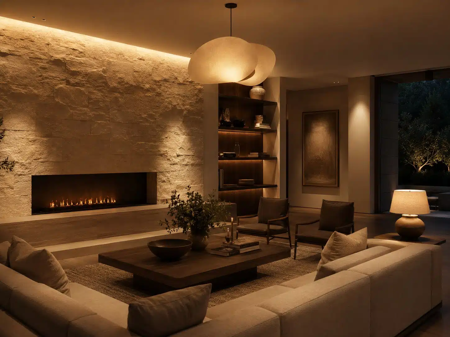
Good lighting enriches materials, makes spaces easier to understand, and renders moments more intimate. Poor lighting can make even the most beautiful interior look flat, chaotic, or tiring.
A professional lighting plan is composed of layers. Ambient lighting facilitates movement and daily activities. Architectural lighting highlights walls, textures, art, and sightlines. Task lighting supports activities such as cooking, reading, or grooming. Decorative fixtures add scale, identity, and atmosphere. These layers are not all used at maximum intensity simultaneously; instead, they are combined into scenes tailored for morning routines, welcoming guests, dining, evening relaxation, and cleaning.
Light color is expressed in Kelvin. A temperature of around 2700K feels warm and cozy; 3000K provides a slightly brighter, neutral warm white that often complements contemporary interiors. Cooler light can be functional but requires restraint in living areas. Consistency is even more important: two light sources labeled “3000K” can look visibly different due to manufacturing tolerances and spectral composition. Therefore, use carefully selected color points and stick to the same product families where pools of light overlap.
CRI (or Ra) measures how faithfully a set of test colors is rendered. For high-end residential projects, we generally recommend a minimum CRI of 90; for art, skin tones, rich wood finishes, fabrics, and food, we prefer demonstrably high quality—specifically with good saturated red rendering (often assessed via the R9 value) and, where available, additional metrics such as TM-30.
A high CRI alone does not guarantee beautiful light; spectrum, color point, binning, optics, and dimming quality remain important.
Architectural lighting means directing light at what you want to see, rather than at the ceiling as a collection of fixtures. Wall-washing enhances the sense of space; grazing makes stone and plasterwork tactile; narrow beams sculpt artwork; indirect light softens the atmosphere. Pay attention to shielding, cut-off angles, and positioning relative to eyes and reflective surfaces. A downlight placed directly above a sofa or a glossy countertop can cause annoying glare.
Dimmability warrants a mock-up setup. Check the entire range for flickering, color shifting, buzzing, and synchronized behavior. “Dim-to-warm” can create a candle-like atmosphere in the evening; “tunable white” can support circadian rhythms but requires carefully programmed scenes. Drivers must be accessible, silent, and appropriately loaded. Emergency lighting, outdoor lighting, darkness levels, and light pollution also deserve attention.
The best results are achieved through mock-ups. Test stone, wood, metal, art, and textiles using the intended fixture, the actual beam, and the dimming controls. Lux levels, uniformity, and power output can be measured; atmosphere must be experienced. A lighting design succeeds when fixtures do not dominate the space but instead present the architecture, materials, and occupants in the right light.
In addition to shape and wattage, specify color temperature, color consistency, CRI/R9, beam, shielding, driver, dimming protocol, and maintenance access.