A timeless material palette in three layers
A successful high-end interior is rarely composed of just one spectacular material. Its strength lies in the composition: the balance between the understated and the bold, the hard and the soft, the matte and the reflective.
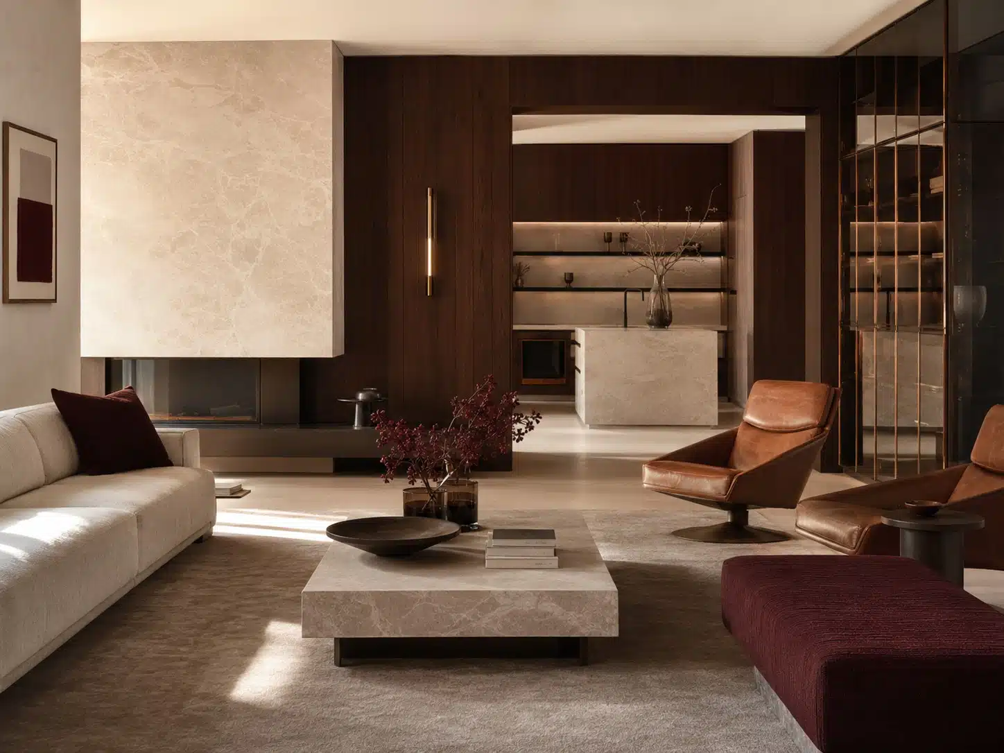
A material palette functions like a family. The foundation defines the overall look—for instance, light natural stone, dark wood, and warm mineral plaster. A second layer introduces comfort through wool, linen, and leather. Metal and glass are then employed to refine lines, direct light, and add accents.
Repetition creates cohesion. The same bronze finish might reappear in a profile, a light fixture, and a handle, without necessarily looking identical in every instance. The hue of cognac leather can subtly echo the tones of wood or a patina. A burgundy accent gains impact when it appears in only a few carefully chosen locations.
Contrast keeps the design dynamic. A calmer wood grain complements heavily veined stone; a matte wall pairs well with glossy glass; soft textiles soften the look of a robust stone volume. In doing so, we evaluate not just individual samples, but the relative proportions of surfaces. A small swatch might appear dominant, yet become merely a refined detail within the actual space—or vice versa.
The final palette is tested under actual lighting conditions. Daylight shifts throughout the day, while artificial light influences warmth, color rendering, and sheen. Using a material board, larger samples, and a 1:1 mock-up allows us to fine-tune the balance before production begins. The result is an interior with a distinctive identity—one that transcends fleeting trends.
In short
Work with a calm foundation, a soft comfort layer, and a few precise accents. Repeat materials, but vary scale and application.